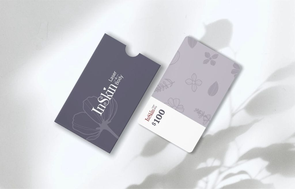
InSkin, a local med spa renowned for its skin treatments sought to elevate its brand presence. With a basic and underdeveloped brand identity, the spa aimed to create a more cohesive and appealing visual language that would resonate better with its clientele.
Challenge:
The existing branding of InSkin was minimal, consisting only of a few basic colors and lacking consistency in fonts, patterns, and other design elements. The spa’s goal was to refine its brand to reflect the quality and professionalism of its services, and to update its promotional materials, starting with a brochure.
Solution:
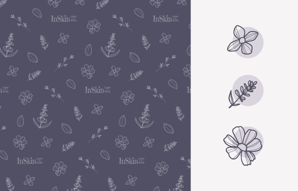
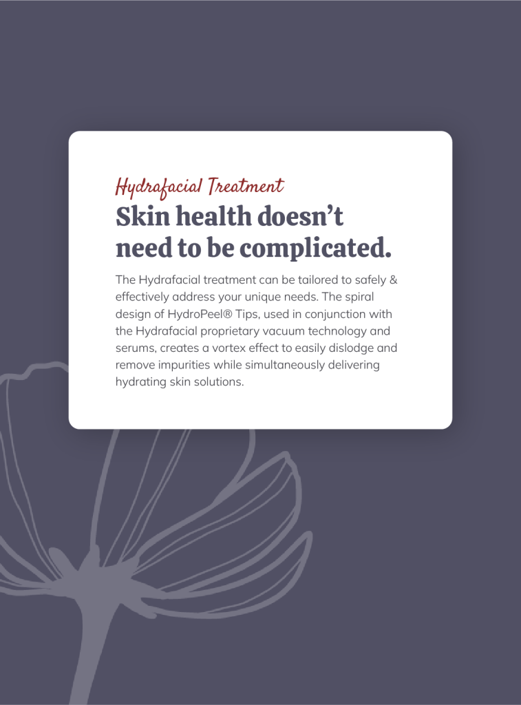
For the Mini Brand design, we revitalized their visual identity by expanding the color palette and introducing a new hierarchy in the use of these colors. We recommended making dark purple/violet the dominant color, supported by a selection of neutral and blush tones, to convey a sense of luxury and calm. This reimagined palette was complemented by hand-drawn patterns and design elements, custom-created to add a unique and personal touch to the brand.
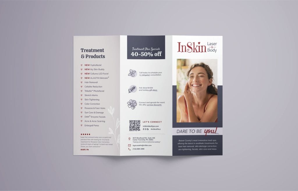
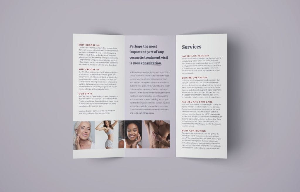
In revising the brochure, we seamlessly integrated these new branding elements, enhancing the layout and updating the content to align with the new visual direction. The brochure edits were designed to improve clarity and aesthetic appeal, ensuring that each piece of promotional material would make a significant impact.
Outcome:
The refreshed branding and updated brochure were met with enthusiasm from the client and their customers. The new brand colors and hand-drawn elements distinguished the med spa from its competitors, creating a sophisticated and memorable identity. The updated brochure effectively communicated the spa’s offerings and enhanced its professional image, contributing to an overall increase in client engagement and interest.
Reflection:
This project highlighted our expertise in creating bespoke branding solutions that not only meet but exceed client expectations. Our approach to using distinctive, hand-drawn elements and a carefully considered color palette demonstrated our commitment to delivering tailored, impactful design solutions. The ongoing partnership with this client allowed for a deep understanding of their vision and needs, facilitating a successful brand evolution.
We use cookies to ensure that we give you the best experience on our website. If you continue to use this site we will assume that you are happy with it.