SweetWater Bikes: Rebrand
Overview:
SweetWater Bikes, known for its specialty in gravel and mountain bikes, embarked on a rebranding journey to establish itself as the premier adventure bike destination in the region. The project involved a full custom branding overhaul, focusing on a logo design that captures the essence of adventure and community while appealing to a demographic of sporty, adventure-seeking individuals.
Challenge:
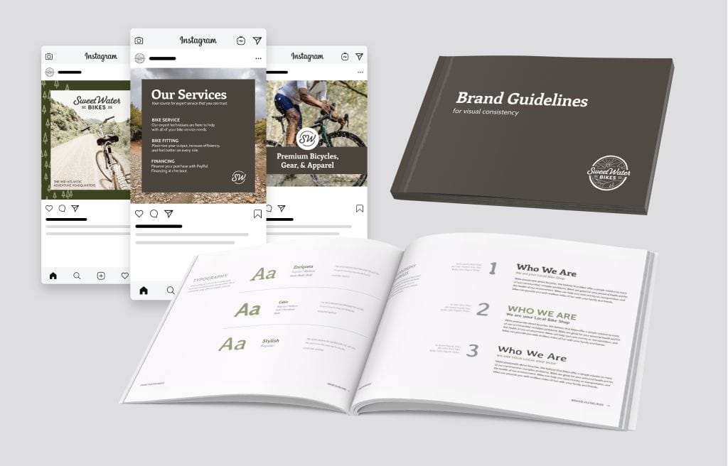
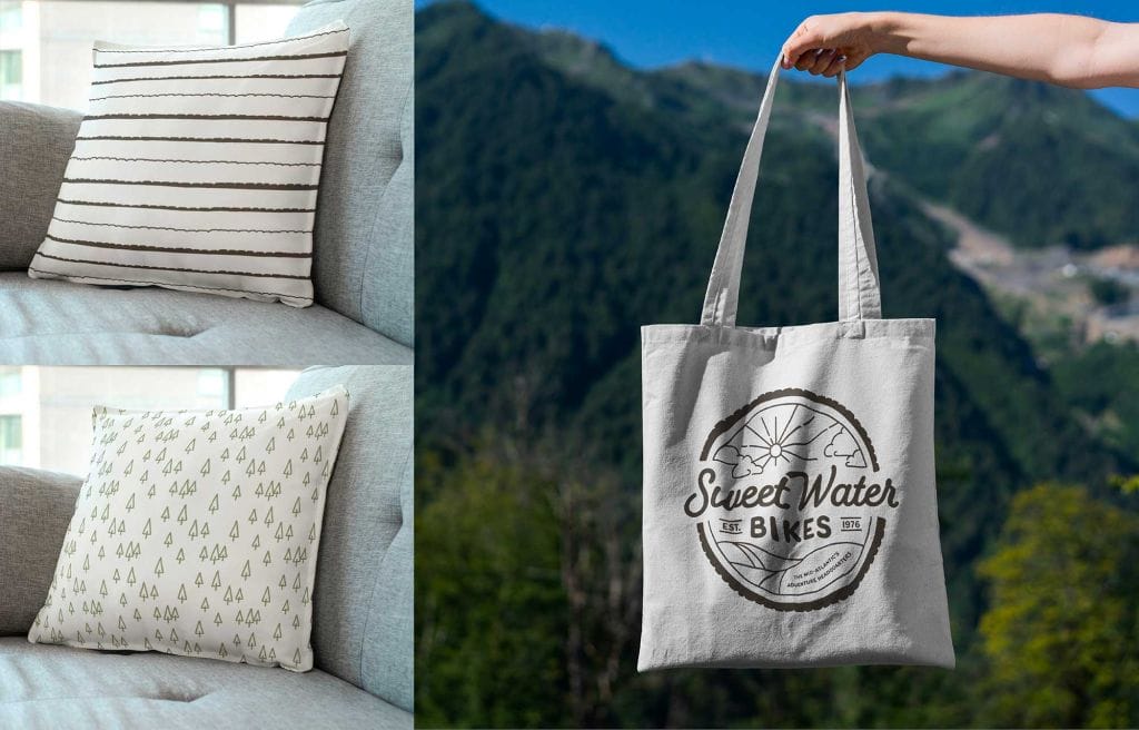
The primary challenge was to create a brand identity that resonated with a diverse audience ranging from millennials to people over 40 with disposable income. The new branding needed to communicate expertise, adventure, and friendliness without being overly masculine. It also had to be scalable and versatile enough to be printed across various media and match the interior aesthetics of the store.
Solution:
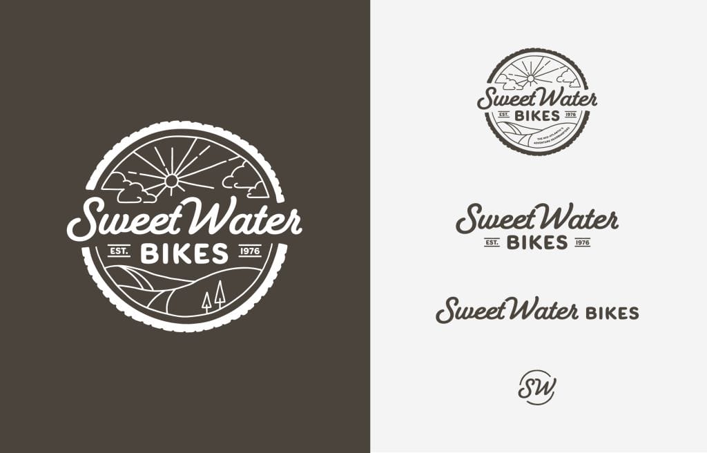
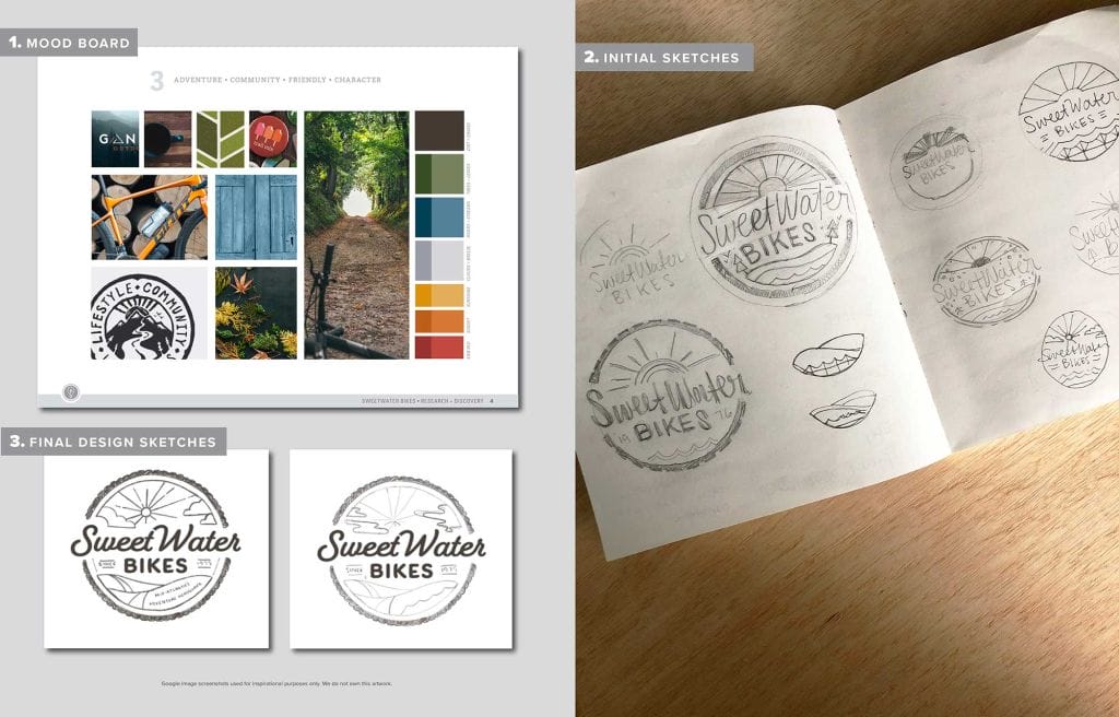
Our approach was to design a logo that contrasts the geometric shapes typical of bike designs with the organic shapes found in nature, reflecting the balance between technical precision and the adventurous spirit of bike riding. Key features of the logo include:
- Shape: A circle motif was used to symbolize community and continuity.
- Typography: A combination of thick script and bold fonts to convey robustness and reliability.
- Color and Texture: The introduction of a third, cool, and reserved color complemented by illustrative and textured elements to give a unique, hand-drawn feel.
- Symbols: Integration of classic outdoor symbols like tire treads, clouds, and fuller trees to evoke a sense of outdoor adventure.
Outcome:
The rebranding and new logo were highly successful, earning Brkich Design Group a GDUSA award in the Logo Design category. The new branding significantly elevated the store’s identity, making it recognizable as a top destination for gravel and mountain biking enthusiasts. The design effectively communicated the themes of adventure, community, and friendliness, attracting a broader audience and enhancing the store’s regional prominence.
Reflection:
This project showcased our ability to blend artistic creativity with strategic branding needs, creating a logo that not only stood out visually but also supported the client’s business goals. The award recognition was a testament to our dedication to design excellence and our capability to deliver a brand identity that truly resonates with the target audience.
About the Award:
The GDUSA 59th anniversary showcase featured roughly 750 projects as well as 14,000+ entries. The projects reflected the increasingly expansive ways in which graphic design serves and shapes commerce and culture. Winners ran the gamut from traditional to new media; from inspirational assignments to bread and butter projects; from large creative agencies and departments to boutique design studios and freelancers.